6 Mobile Menu Design Rules to Boost Hotel F&B Revenue
Fixing user experience flaws on hotel mobile menus can boost order values by up to 34 percent.
The short answer
Fixing user experience issues on hotel mobile menus prevents cart abandonment and drives higher order values. Properties implementing automated upselling and optimized visual layouts see check increases up to 34 percent.
The short version
- 70 percent of consumers prefer ordering direct online, making mobile menu user experience vital for F&B revenue.
- Automated upselling prompts boost hotel digital order values by 15 to 30 percent.
- One-tap reordering and clear dietary filters remove purchase friction for multi-night guests.
Optimizing hotel mobile F&B menus requires addressing user experience flaws that cause cart abandonment [1]. By implementing high-impact item placement above the fold, clear dietary filters, one-tap reordering, and automated upsell prompts, properties convert browsing guests into active buyers and raise check averages [1].
Why do visually appealing mobile menus fail to convert sales?
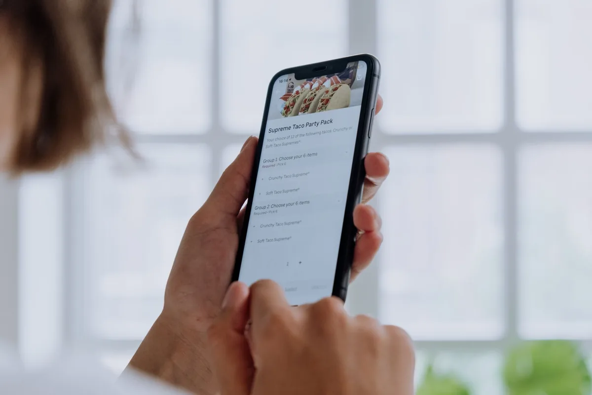
High-resolution imagery and elegant typography do not guarantee orders if the user experience causes friction [1]. As reported by eHotelier, 70% of consumers prefer ordering online directly from restaurants, yet hotel menus often fail to capture this revenue [1]. When guests encounter an overwhelming first screen packed with options, decision fatigue sets in [1]. Burial of item modifiers behind tiny icons or sub-menus further drives guests to abandon their carts entirely [1].
How should high-margin items be placed on a mobile menu?
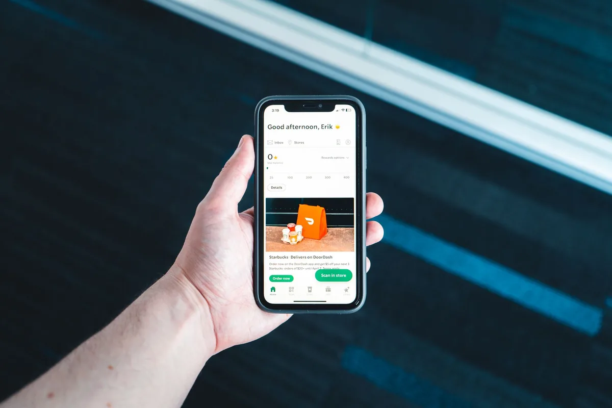
High-margin and top-selling dishes require prime placement at the top or centre of the mobile screen [1]. Hotel menus need visual hierarchy through bold text, icons, or distinct background colours to guide the reader's eye toward profitable offerings [1]. Pulling 12-month performance data helps operators identify items with the highest conversion rates and revenue per visitor, ensuring those specific items appear above the fold [1].
What design steps simplify customisation and dietary filtering?
Customisation options must be instantly accessible via checkboxes or toggle buttons on small touchscreens [1]. Missing or obscure dietary details force guests to scan entire menus or abandon the order [1]. Implementing clear tags, universal icons like plant symbols for vegetarian dishes, and dedicated filter options allows guests with dietary restrictions to select meals confidently [1].
| Design Area | Common Mistake | Recommended UX Fix | Measured Impact |
|---|---|---|---|
| Item Placement | Alphabetical or flat lists without visual hierarchy [1]. | Position top-converting items above the fold using visual accents [1]. | Directs guest attention to high-margin dishes [1]. |
| Customisation | Modifiers hidden inside sub-menus or small icons [1]. | One-tap toggles and visible checkboxes on item screens [1]. | Prevents cart abandonment from ordering friction [1]. |
| Upselling | Dependence on busy staff to suggest add-ons [1]. | Automated pop-up prompts for complementary items and combos [1]. | 15–30% increase in average check values [1]. |
How do automated prompts drive higher average order values?
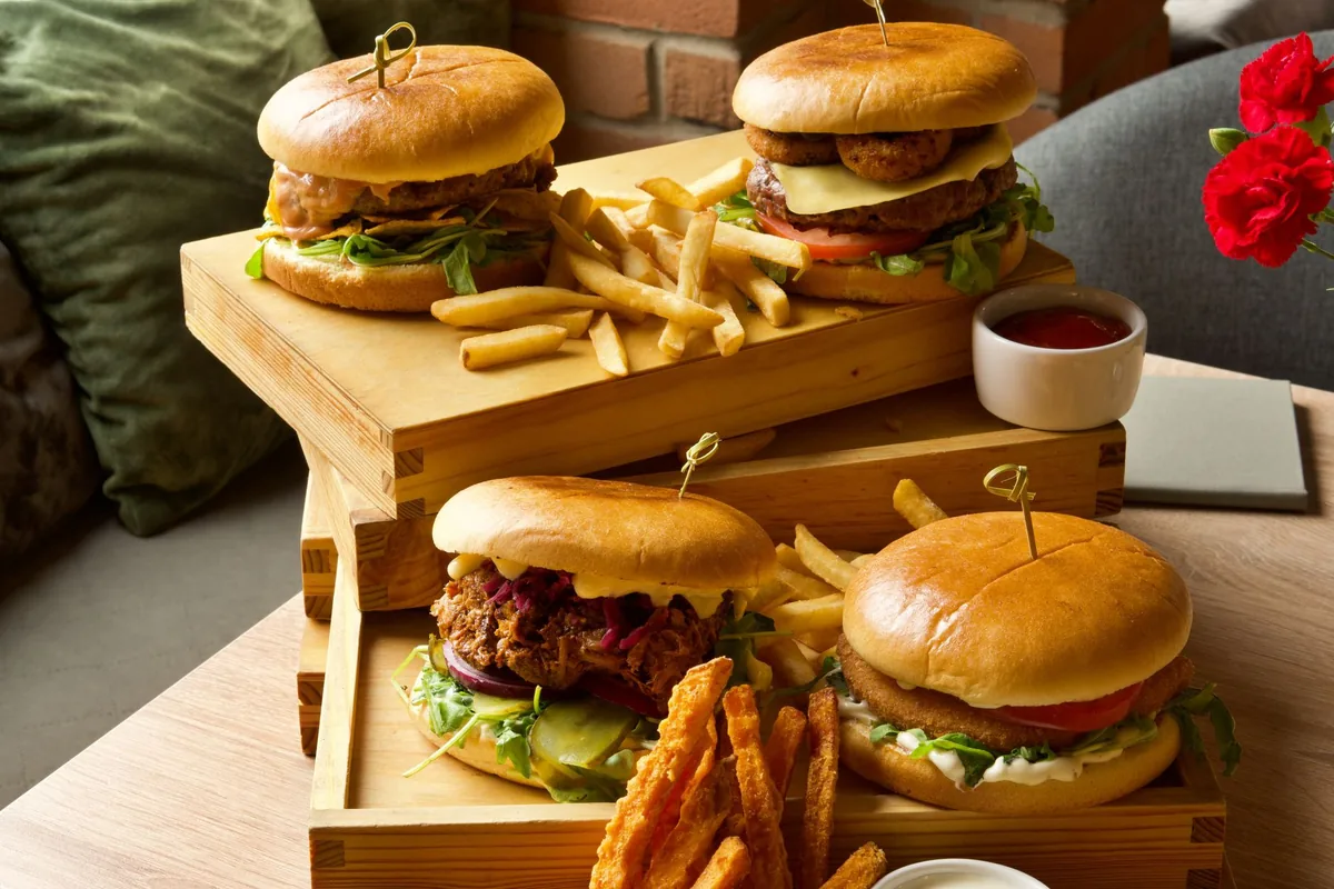
Automated software prompts consistently suggest complementary add-ons every time an item is selected [1]. For example, selecting a burger triggers options for sweet potato fries or premium milkshakes [1]. Properties utilizing digital upselling prompts see 15–30% higher average check values, according to eHotelier [1]. A leading Sydney hotel achieved a 34% rise in order value after introducing these automated prompts [1].
Why is one-tap reordering crucial for multi-night hotel guests?
Repeat guests benefit from stored order history that allows reordering in seconds [1]. Eliminating the need to rebuild orders from scratch reduces friction and increases ordering frequency over multi-night stays [1]. Adding simple "Add to Cart" buttons alongside a saved favourites feature builds guest loyalty while driving higher total F&B spend [1].
Reported by
This article was written from the following reporting. Follow the links for the original coverage.
- [1]6 Mobile Menu Design Rules to Boost Hotel F&B Revenue— eHotelier
Frequently asked
+Why do guests abandon mobile menu orders in hotels?
Guests abandon mobile menu orders when faced with decision fatigue from cluttered screens, hidden customisation options, or missing dietary information [[1]].
+What percentage of consumers prefer direct online restaurant ordering?
According to industry data cited by eHotelier, 70% of consumers prefer to order online directly from restaurants [[1]].
+How much can digital upselling increase average check values?
Digital upselling prompts increase average check values by 15% to 30%, with specific properties reporting gains up to 34% [[1]].
+Where should top-selling dishes be placed on a mobile menu?
Top-selling and high-margin items should be positioned above the fold at the top or centre of the screen [[1]].
+How do dietary filters improve mobile menu conversions?
Dietary filters and clear visual tags help guests quickly identify vegan, vegetarian, or allergen-free dishes, giving them confidence to complete their order [[1]].
Keep reading
Our reporting
More in operations